Mockup of Juniper Life Insurance screen

Juniper Life Insurance

Changing how Canadians buy life insurance products directly online, without having to provide fluids or talking to an agent.

July 2017

Background & Overview

Start-up life insurance company looking to disrupt the industry, targeting a younger demographic.

Juniper Life Insurance and Humania Assurance Inc. have teamed up to provide Canadians easily attainable and affordable life insurance. Humania Assurance has been in operation for over 80 years, with roots dating back to 1874 as a fraternal benefit society.

At the time of this product release, the company insured more than 200,000 members across Canada.

My Role & What I Did

Senior Product Designer.

As part of an agency, I worked directly with the client and their executive team to develop a strategy. Other deliverables I worked on were:
  • Stakeholder interviews
  • Information architecture
  • Rapid prototyping
  • Visual Design

Main Challenge

How can we take the stress out of buying a life insurance policy by making the experience as comfortable as possible?

Applying for life insurance can be a difficult process. Emotionally, because it means thinking about the unthinkable, and practically because the application process is often lengthy and confusing. The goal was to rework the entire process by putting the end user in the driver’s seat. We wanted to give customers a simpler way to purchase life insurance, making it easier to get the answers they’re looking for and taking the fear out of buying a policy.

Discovery & Research

I worked directly with the executive team to understand key customers and their pain points and desires.

Using information and supporting data, I worked closely with the Product Strategy team to create a series of user personas to reference.
Image of a persona used in Juniper Life Insurance
It was imperative for me to understand the current process of purchasing life insurance. I spent several days simulating the process through Humania’s existing platform. The results were less than stellar. In a best case scenario, users would have to go through almost a hundred questions, often involving very personal information. The users would not receive any feedback during the process and depending on the answers given, the application may be rejected before they would even get a quote.
Image of a mindmap used during the discovery process of Juniper Life Insurance

Solution

Making the process a conversation, instead of an interrogation.

I designed a new purchase path that gave the client a quote after the first three questions, giving them the chance to decide if they wish to continue with their application early on.
Image of Juniper Life Insurance user flow
During the discovery phase, I kept reiterating the complexity of getting a life insurance policy for the average person. Since applications are filled with jargon and industry lingo, it makes it difficult for any applicant to truly understand the process usually ending in frustration.

I decided to take a different approach — teaming up with a UX Writer, we rewrote the questions to be as friendly as possible. During this process I had a light bulb moment: the application shouldn’t be just another set of dry questions; it should be a conversation.

I quickly put together a concept user interface that allowed us to use a conversational approach from end to end.
Image of first attempt at conversational user interface of Juniper Life Insurance

Visual Design

Getting creative with the visuals to elevate the experience and delight clients.

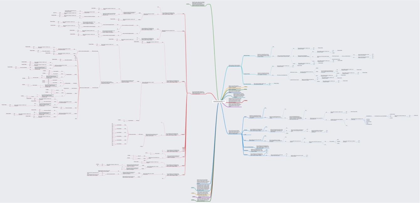
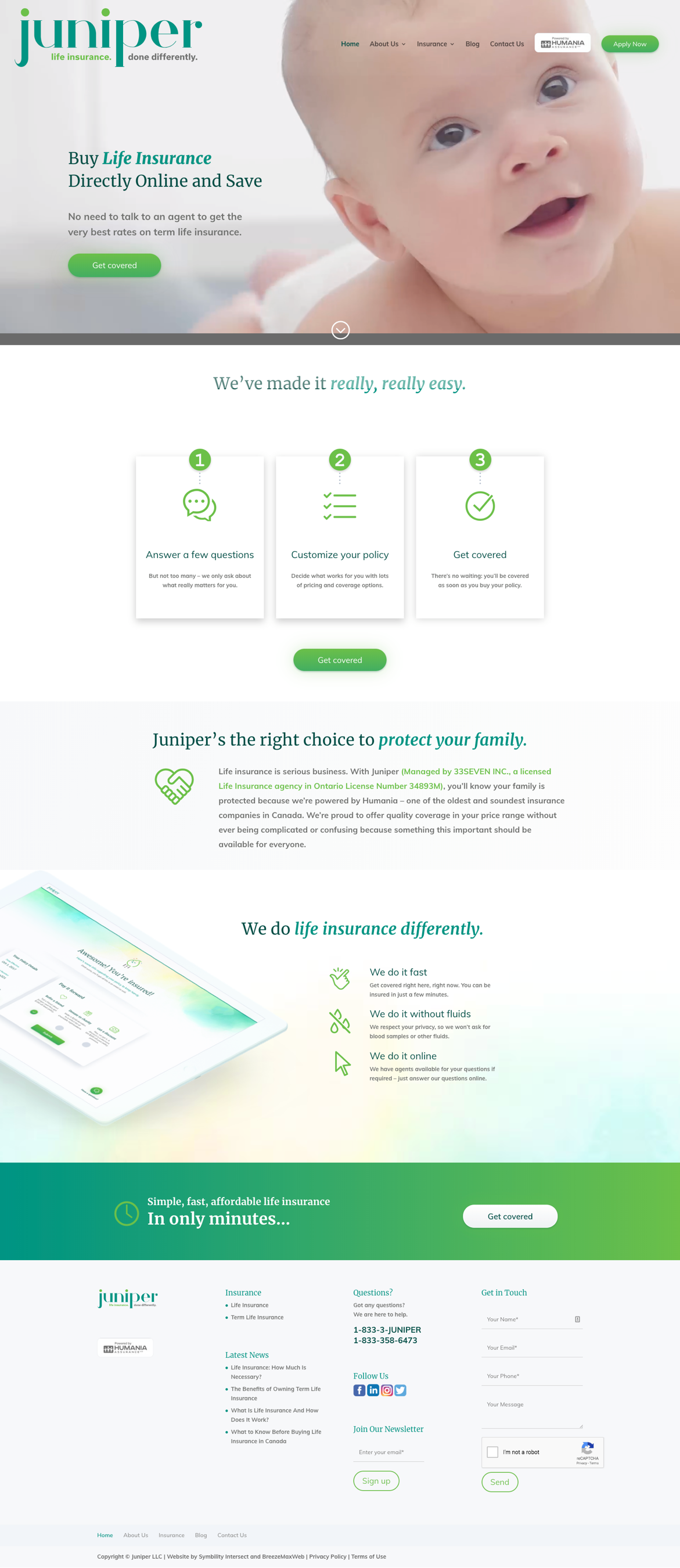
A life insurance application means sharing a lot of information, so I made sure to design each step of the flow to be as straightforward as possible. The idea was to keep the user moving as quickly and efficiently as possible towards their desired goal. Most questions are multiple choice, and I made sure that the ones that weren’t (e.g. the user’s name or address) were easy to understand and answer.

I wanted to give the user all the information they needed without overwhelming them, so I made sure to incorporate tooltips throughout the interface. This gave us the space to provide clarification or meet legal requirements where needed, but keeping the language and design of the main user flow as simple and friendly as possible.
An sample image of Juniper Life Insurance interactions
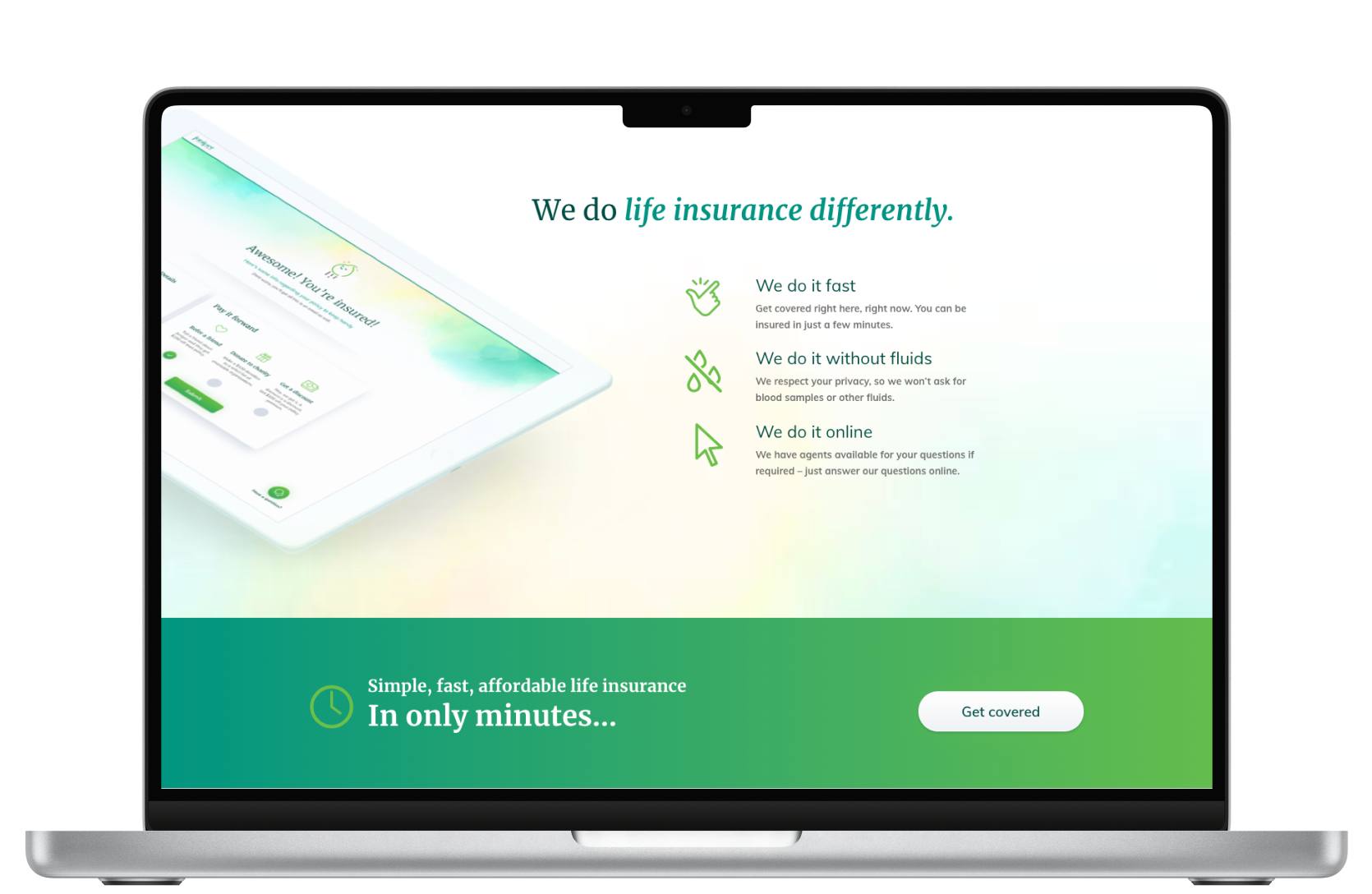
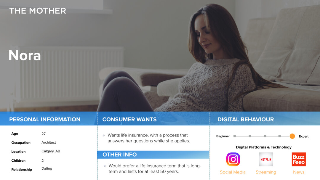
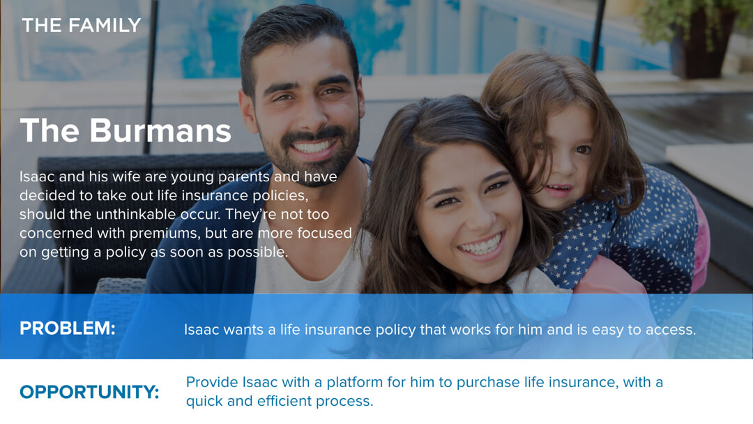
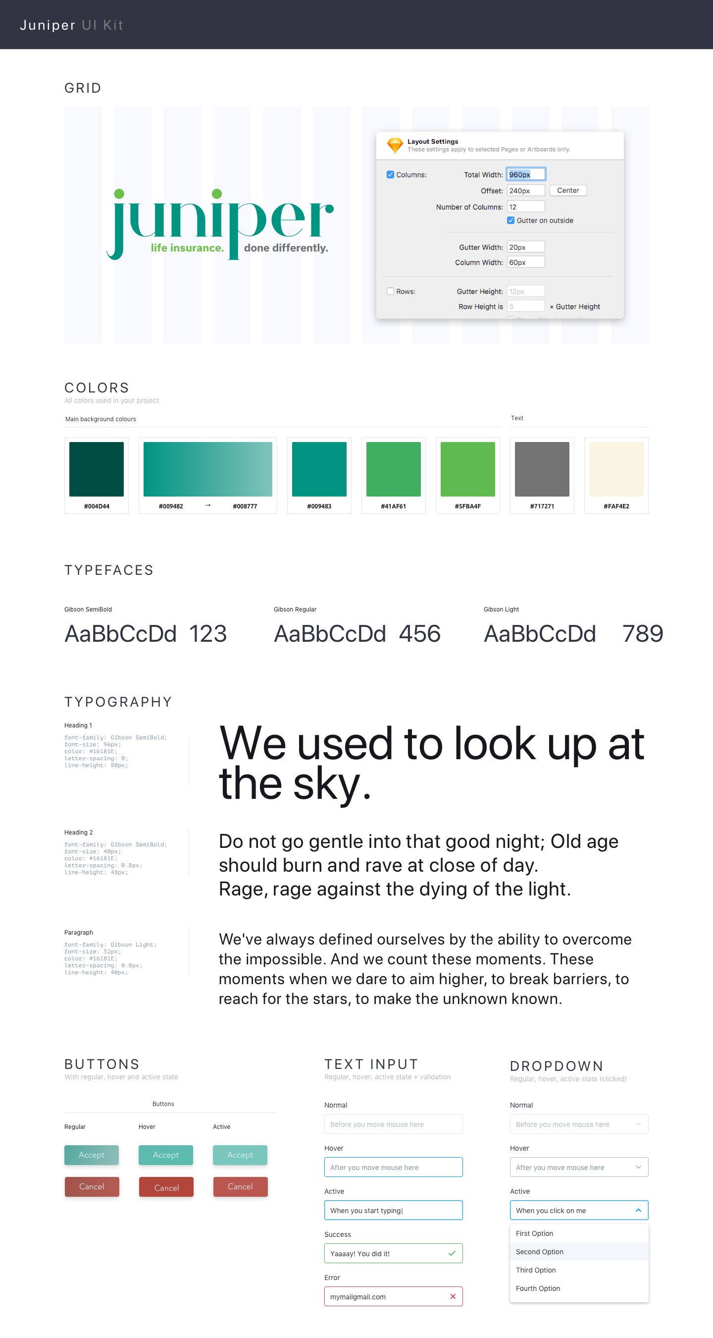
We were also given carte blanche when it came to the visuals. Other than a pre-existing logo and a basic colour palette, I had a lot of freedom to flex my creative muscle. During the research phase our personas revealed that most of Juniper’s potential users were millennials who were new or expecting parents. Based on this we created Baby Juniper as an avatar to add a friendly face at each step of the application. I also chose warm colours and simple typography to create a welcoming atmosphere.
An image of Juniper Life Insurance style guide
An sample image of Juniper Life Insurance landing page

Results & Lessons Learned

Great visual design does not always translate to a good experience.

Based on the conclusions we came to during the research and design process, we created a product that made a daunting task into a pleasant experience.

There are a few things I would have done differently if I had to start over. Primarily, I would push for proper user testing to gain insights and understand the client better. The issues that ultimately cost the company user drop-offs at the initial stages could have been easily identified during a user testing phase.